This is from 2012 | 3 minute read
Connecting Design Research to Value
There's a simple way to illustrate the value proposition of a new company, and I've found it to be extremely effective in communicating the worth of a hypothetical new product or service.
First, introduce an actual user that you've spoken with.

If you are using presentation software, like Powerpoint, use a full-screen image of the person doing their job. This suggests that you've spent time with a potential user, and it immediately humanizes your intent: it indicates that you are presenting design-led innovation, as opposed to technological or business-led innovation.
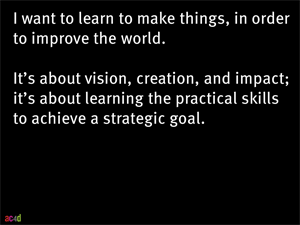
Describe the person's main want, need, or desire.

This is sometimes called a "pain point", but I feel that the word "pain" is too simplistic (the language I've used—want, need, desire—is probably too simplistic as well) because this is often subtly aspirational. Illustrate that you both understand and empathize with the person by emphasizing the emotional result of this need not being met.
Use their words.

Quote the user, verbatim, in order to substantiate the need. If you are using slides, I've found it extremely effective to overlay the quote in REALLY BIG LETTERS on top of the user.
Repeat for two or three users.


Show that you've spoken with several users and identified a running theme, a pattern.
Summarize your synthesis.

Using a single slide, show the users again, and illustrate the high level summary of your interpretation of your research. This is where you show an inferential leap: where you combine empathetic research data, and build upon it, to produce insights. I've found it useful to show each user again, summarize their quote, and then show my interpretation directly below it.
Identify the implications of your synthesis.
Using a slide per insight (no more than three), explain what the implications of your insight are on a potential new system or service. At this point, you are identifying new constraints: you are describing how you are artificially constraining a blank canvas of new ideas, in order to suggest a new and valuable service.
Introduce the product or service.
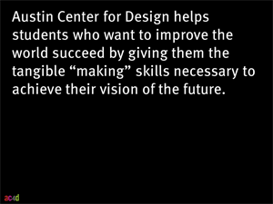
Use the widely used formula: We help [your most promising prospects] that [need help with the pressing concern you address] succeed by [providing the material improvement you will deliver].
From here, alternative approaches work, depending on the audience. If you are presenting to investors, you might show how the service works to generate revenue, and then transition into a discussion of financials. If you are presenting to a technical audience, this might be an opportune time to introduce a "how it works" diagram, emphasizing the technological stack and architecture.
Using this style of presentation works because it gives your audience a point of reference, a place from which to judge your design and idea. It helps them see the world from a different perspective. And it offers a rationalization for your product or service, but in human terms. It doesn't try to prove the giant potential of your market, which investors see through quickly, and it doesn't claim a massive technical innovation, which technologists are implicitly skeptical of. It's a designerly way of showing value.
Originally posted on Mon, 11 Jun 2012